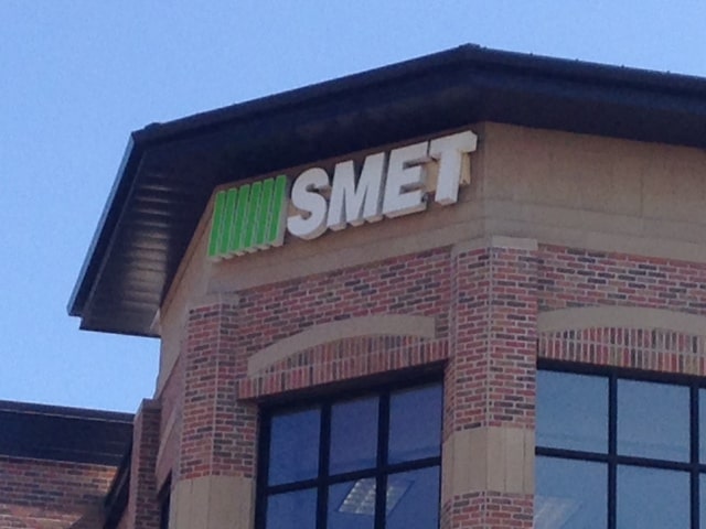
We all need to make changes once in a while just to stay up to date and to keep current and fresh. That’s the idea behind recent changes in our logo at Smet headquarters. “The new look is cleaner and the colors represent our drive for quality and to stay current.” says Scott Smet, CEO of Smet Construction Services.
The changeover to the new look began last year with our updated website. Then earlier this year the new look was carried out in our stationary, advertising and marketing pieces. Recently the changeover was completed with signage updates. And now we are proud to say all of our communication pieces are unified with the new look.
Smet’s Karen Klevesahl who was the lead in the changeover effort said: “I like it, it’s much more current, plus it stresses the LEED and sustainability aspect of our work. “ Recently Smet has achieved several environmental awards on behalf of its clients, and the new colors emphasize our environmental concern we have in sustainable design practices which continues as a major trend changing the construction industry and how we do business.
But, just because we’ve updated doesn’t mean we are changing our focus. Since 1934, we have had the same concern for quality as when Robert Smet became known for quality custom homes. We remain values driven, and our desire to innovate is the same. We remain focused on our communities, and carrying out our projects with the same outlook, the concern for our customer’s satisfaction.
In other words, we have the same vision as we’ve always had! It’s a new look! But it’s the same vision that has sustained us in the past!
For more information:
Greg Polacheck, Director of Market Research
[email protected]
